How To
How to Make a Graph on Microsoft Excel in 4 Steps
- May 28, 2021
- Updated: July 2, 2025 at 4:05 AM
Using Microsoft Excel on Windows and Mac is becoming one of the best ways to store, manipulate and analyze data. With many different features specifically for data analysis, it is easy to understand why the program is so popular.
One of the ways you can present your data is through the use of graphs and pie charts. This may sound complicated to do within a computer program, but fear not, Excel has made it a simple process.
Enter Data Into the Spreadsheet
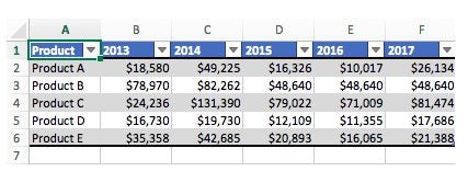
Before you can start to make a graph, you first need to have data available. In your Excel spreadsheet add the data that you want to create the graph for. Also, make sure to add clear headings to your columns and rows as this will be included in your graph’s axis and is needed to clearly understand what you are looking at.
Select the Range of Data to Be Used in the Graph
Next, you need to highlight the data that you want to use in your graph. You can do this by clicking and dragging the mouse across the cells you want to use. Remember to include the headings.
Choose Chart Type

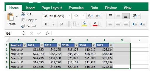
With the data selected click on ‘Insert’ in the top ribbon, now navigate to the dropdown list of all the ‘Recommended Charts’ and choose the graph that will best represent your data from the various options. Once you’ve clicked on the chart type, the program will automatically generate your graph from the data you selected.
Check and Improve Your Graph
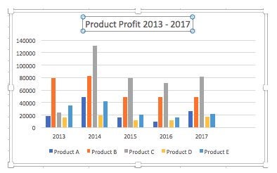
Now that the graph has been generated you can check that the elements appear correct, and make adjustments such as the size of the graph, title of the graph and axis, change the colors used, and the display.
Creating Simple Graphs to Represent Data in Excel
With Excel, it is simple to create graphs to represent your data visually. Being able to use graphs is great when you need to present information to others as it makes the data easier to understand and visualize.

Latest from Shaun M Jooste
You may also like
 News
NewsAfter two decades of waiting for it, this medieval game that fans kept asking for is back
Read more
 News
NewsWe do not lose faith in the adaptation of 'One-Punch Man'. The project is still going strong, although we will have to wait
Read more
 News
NewsKeke Palmer will star in the adaptation of this 1980s movie
Read more
 News
NewsIf you're a fan of Yellowstone, you can't miss this period series that just premiered on Netflix
Read more
 News
NewsThe surreal stories of Chuck Palahniuk will return to the big screen with this adaptation
Read more
 News
NewsThe director of 'Wuthering Heights' wants it to be the 'Titanic' of a new generation
Read more